SEEKING THE MEANING
PURPOSE & VISION
"The Gathering" at it's core is a small group of God's people who's entire focus is to "devote themselves to the apostles' teaching and to fellowship, to breaking of bread and to prayer."
When presented with this project, the true challenge was to create a brand that not only felt current and contemporary and could be used in a wide array of modern applications, but also maintained a traditional "one-room chapel" like aesthetic.
ANCHORING THE IDENTITY
THE LOGOMARK
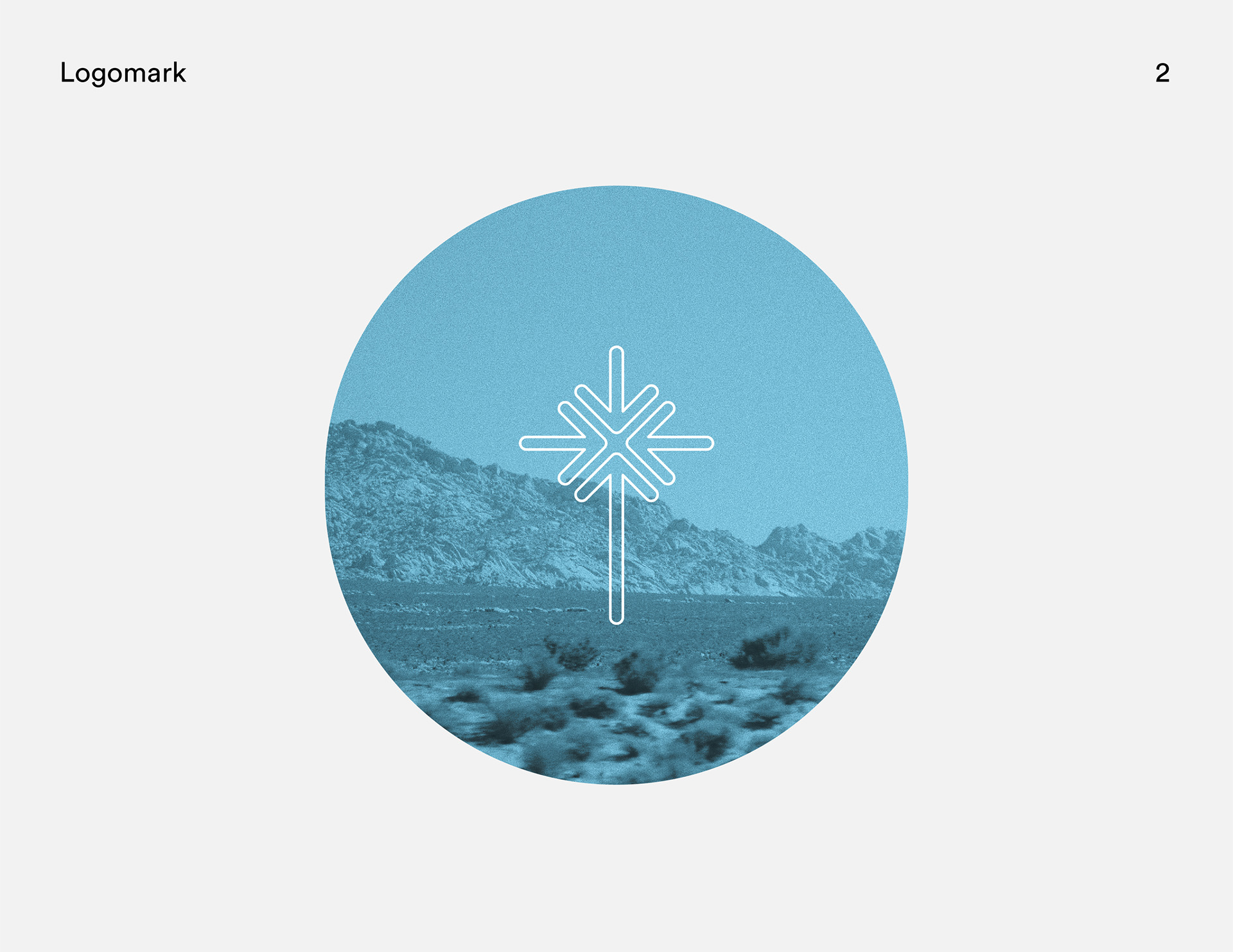
As an anchor is the immovable object that keeps the ship from ever wavering and drifting, so the cross of Jesus Christ, for His followers, is the image that which they fix their eyes. It is the pinnacle of reconciliation between God and man. According to Acts 2:42-47, the role of the church is simple and it's focus is singular.
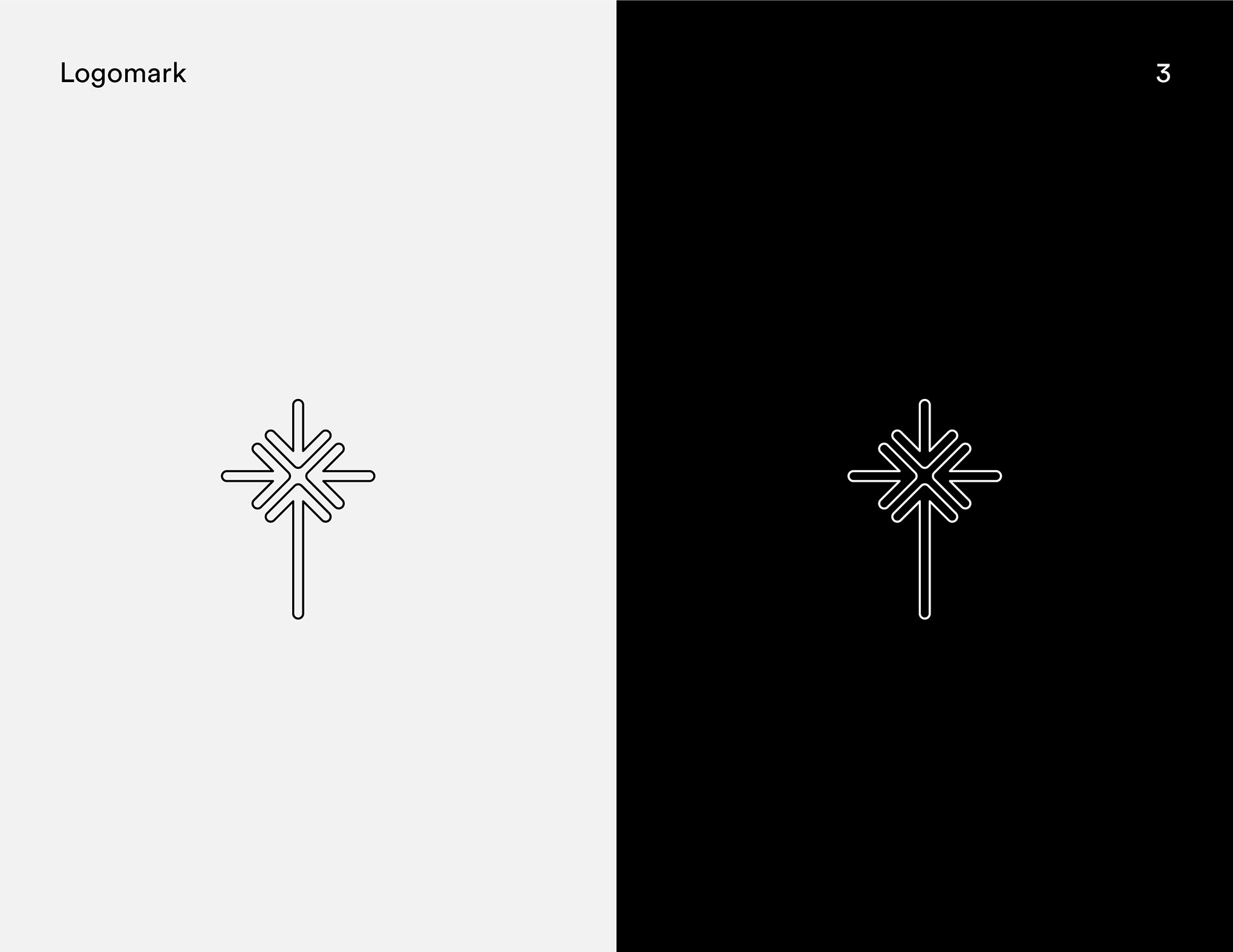
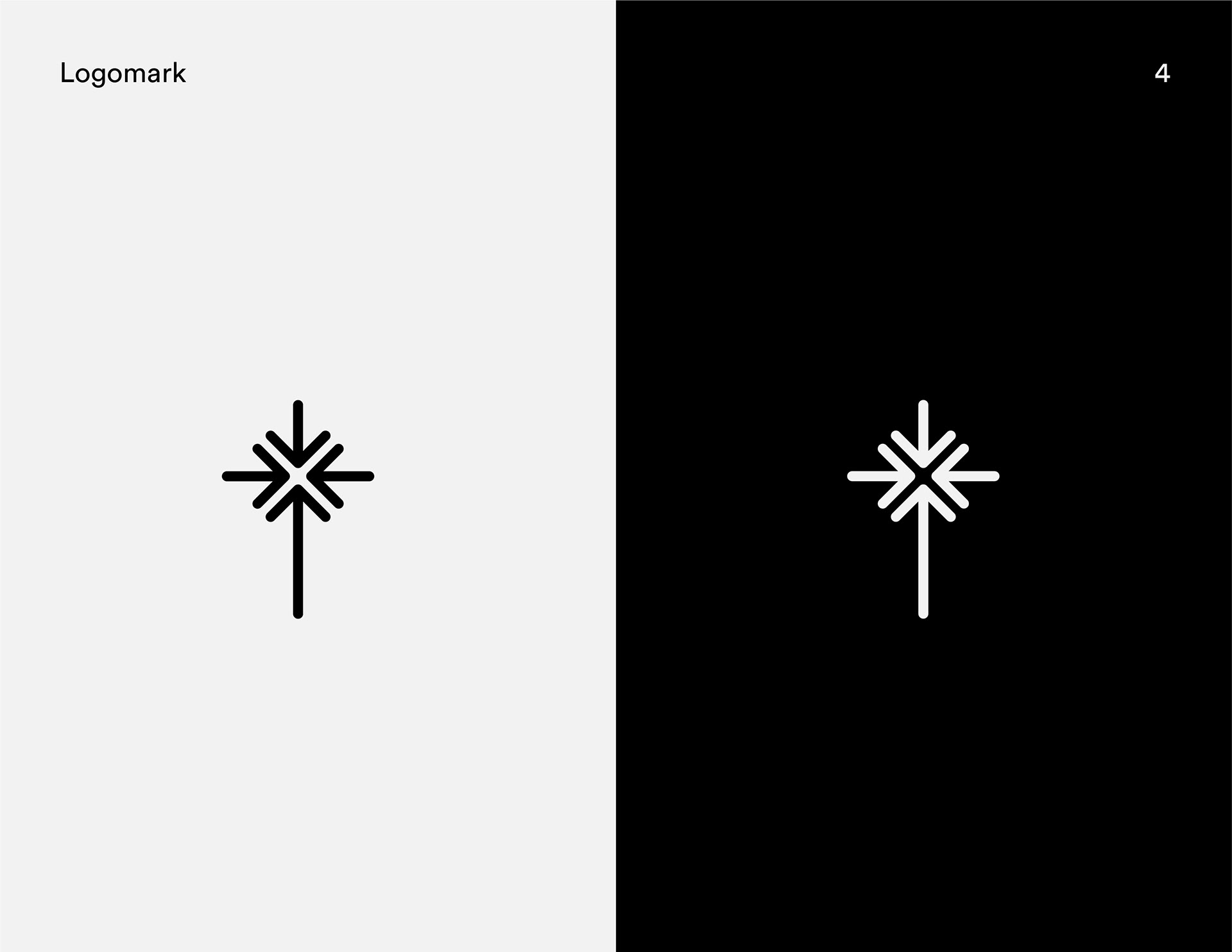
Choosing the cross as the logomark created it's own set of challenges. On one hand, the brand is instantly something people recognize and are familiar with but on the other hand how can one adapt the cross to some degree to make it unique and say all that it needs to say at a glance.
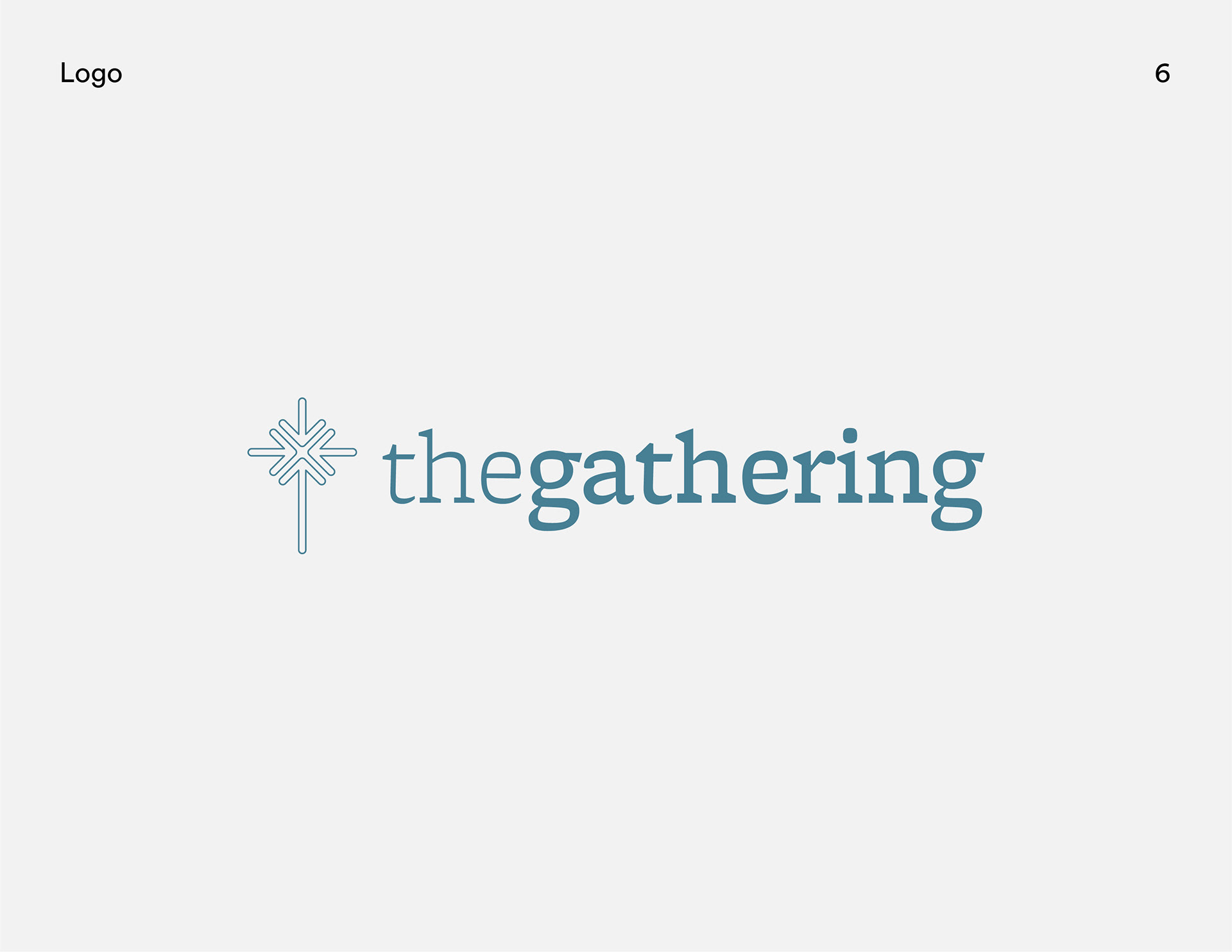
The arrows point inward creating a sense of movement, but they also point to each other representing the aim of the church to "meet together" and "pursue each other."
KEEPING WITH TRADITION
THE LOGOTYPE & LOGO SYSTEM
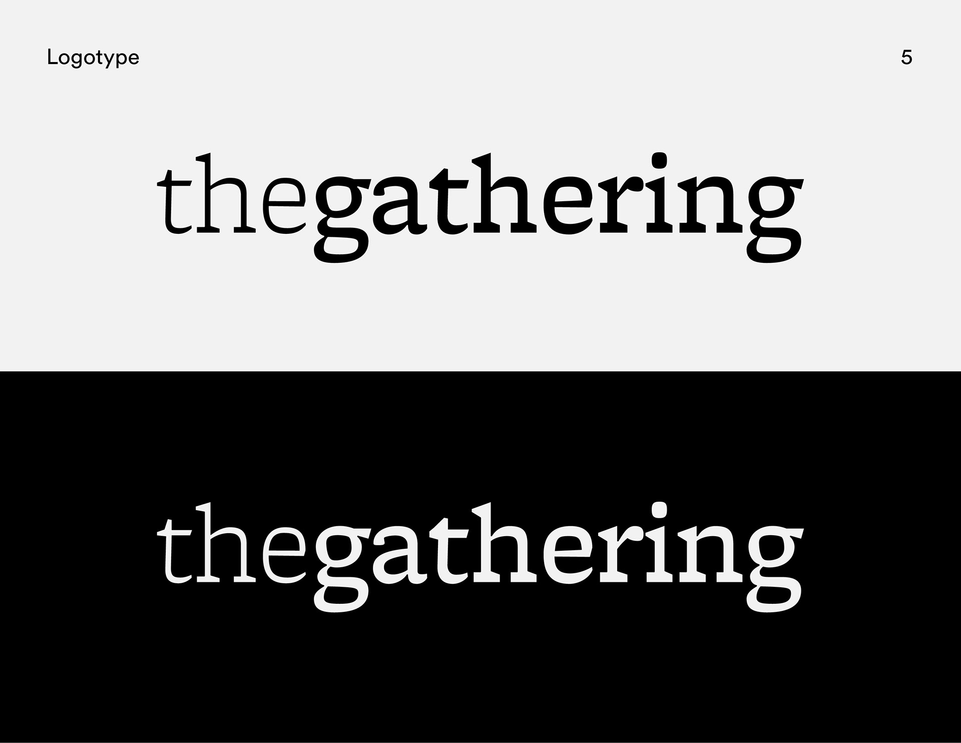
The logotype uses a modern yet traditional serif which evokes a sense of familial nostalgia. As opposed to an assumed space between words, the logotype varies in weight to shift attention to what matters most.
In the full logo lockup, the juxtaposition between a contemporary logomark and a traditional logotype reassures the brand is new but holds to the classic and ancestral vision.
BUILDING A SYSTEM
COLOR PALETTE & TYPEFACES
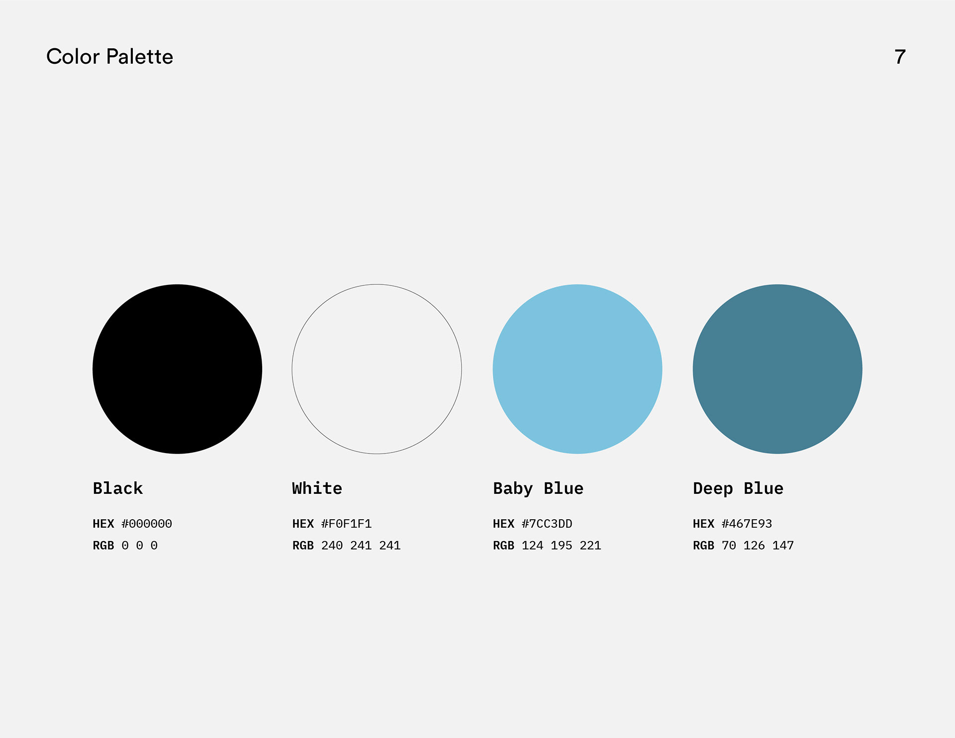
The color palette is simple and insures the brand stays recognizable and consistent. The "Black" and the "White" keeps the brand versatile, where as the "Deep Blue" stations itself as the primary color of the brand leaving the "Baby Blue" for bright pops of color. The palette is the inspiration, the light and the peace to the brand.
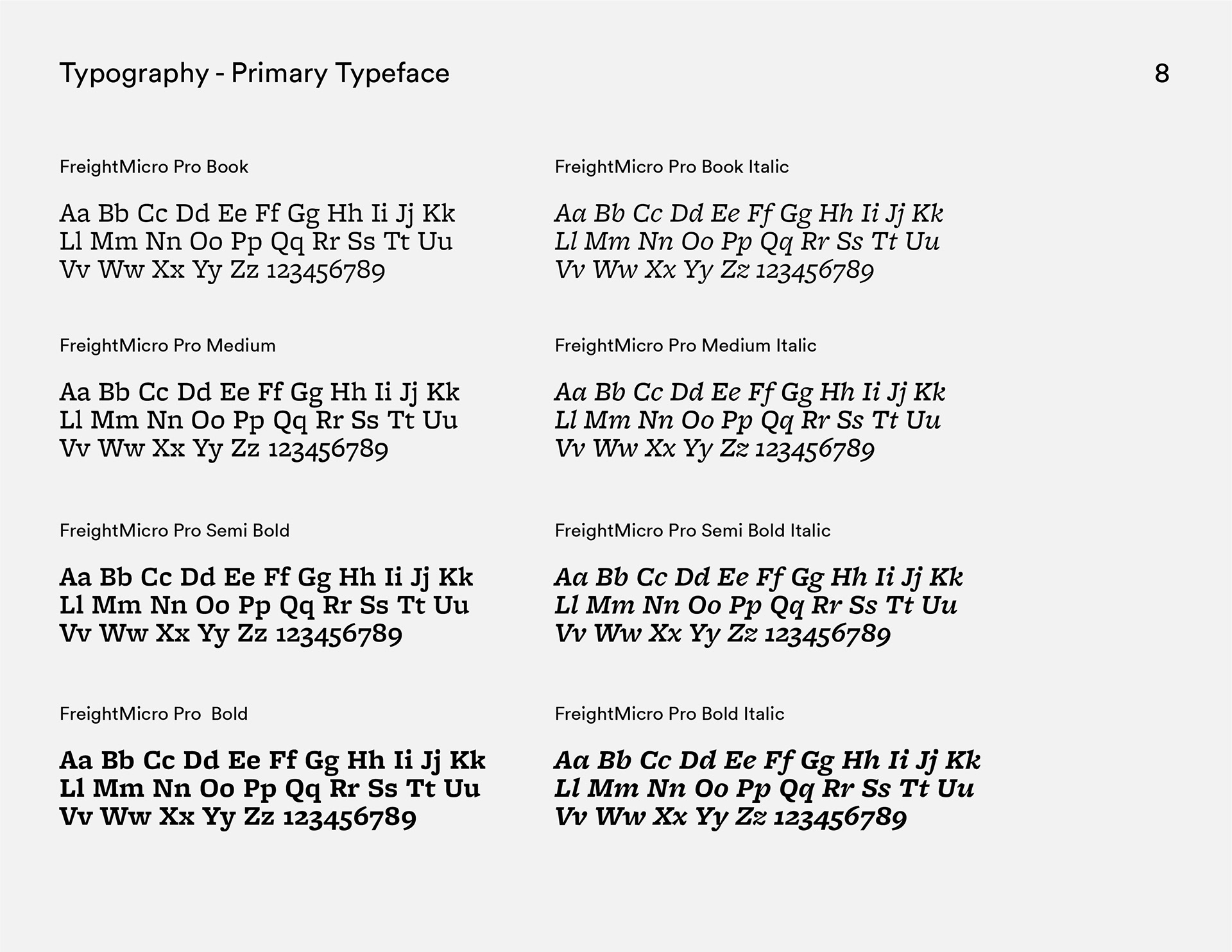
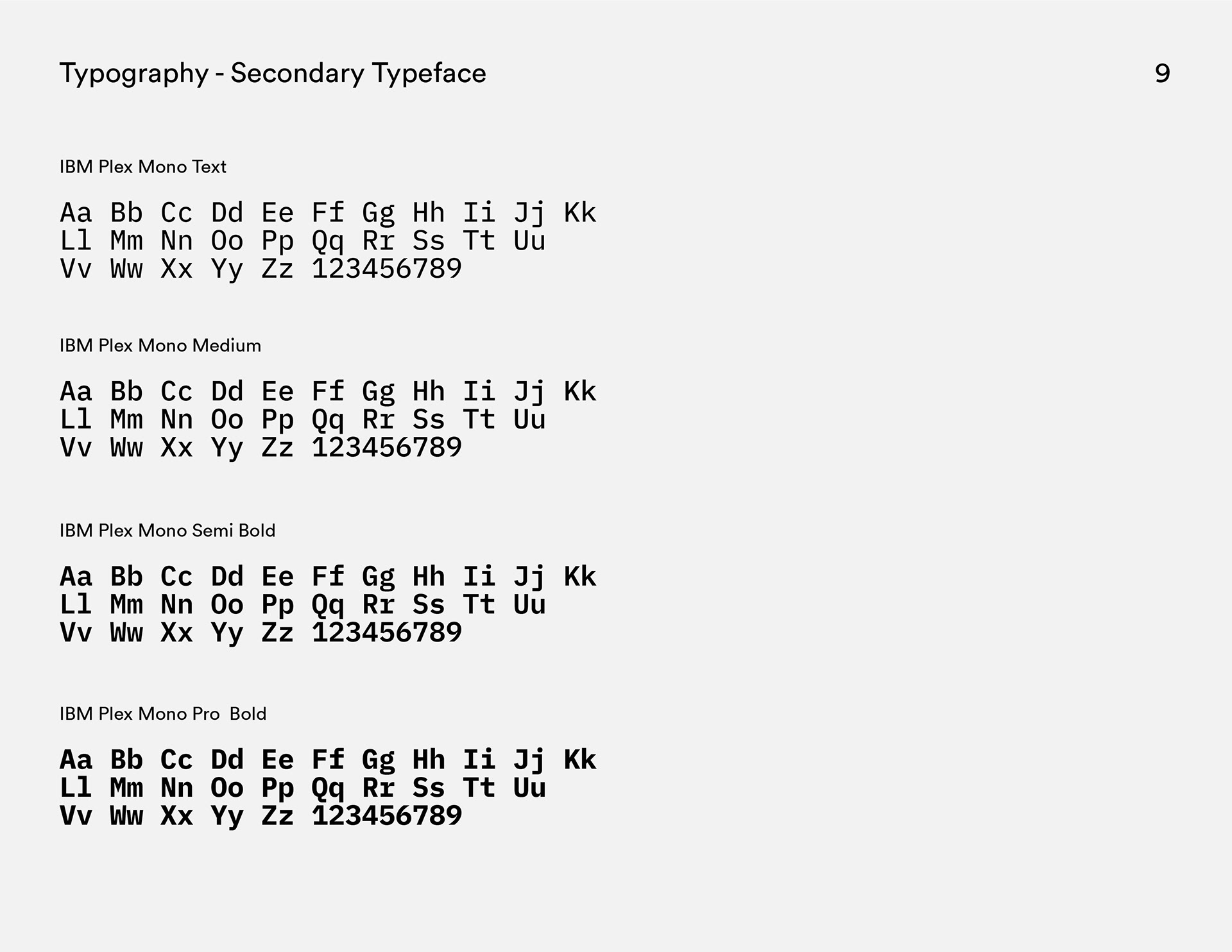
The primary typeface is FreightMicro-Pro pulling from the logotype itself. For displays and headings, FreightMicro-Pro Italic pushes the otherwise modest typeface into the spotlight as if saying, "I can adapt!" The secondary typeface is IBM Plex Mono. Standing opposite to the primary typeface, IBM Plex Mono offers no surprises. IBM Plex Mono guarantees the brand stays grounded and honest.
PLEASE BRAND RESPONSIBLY.
THANK YOU!
FEATURED ON
KREAFOLK.COM

